
Colour harmony means that certain colours have the same undertone and value and intensity range. In colour analysis this means that colours in a certain colour palette have the same undertone, value and intensity range, and therefore they are in harmony with each other. Colours in a certain colour palette also go together, so it is effortless to try out different colour combinations. A person who represents a certain colour season has the same colour qualities in their natural features (skin undertone, natural hair colour and eyes) as their colour palette. Therefore, the person´s natural features are in harmony with their colour palette.
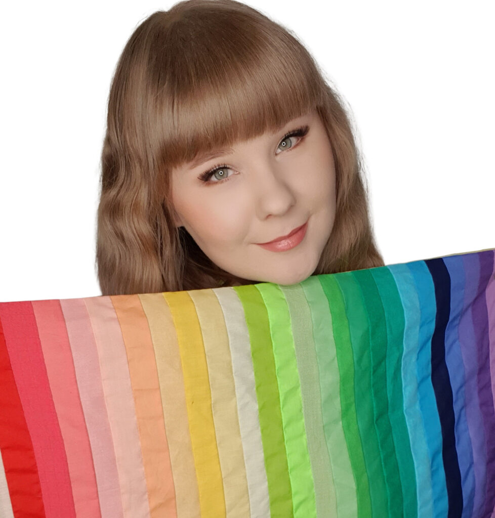
For example, true spring colours are warm (yellow-based), bright, saturated colours, and relatively light. True springs have these same colour qualities in their natural features as their true spring colour palette. Therefore, their colour palette is in harmony with their natural colouring. The picture below shows me with my true spring colour palette as an example of this.
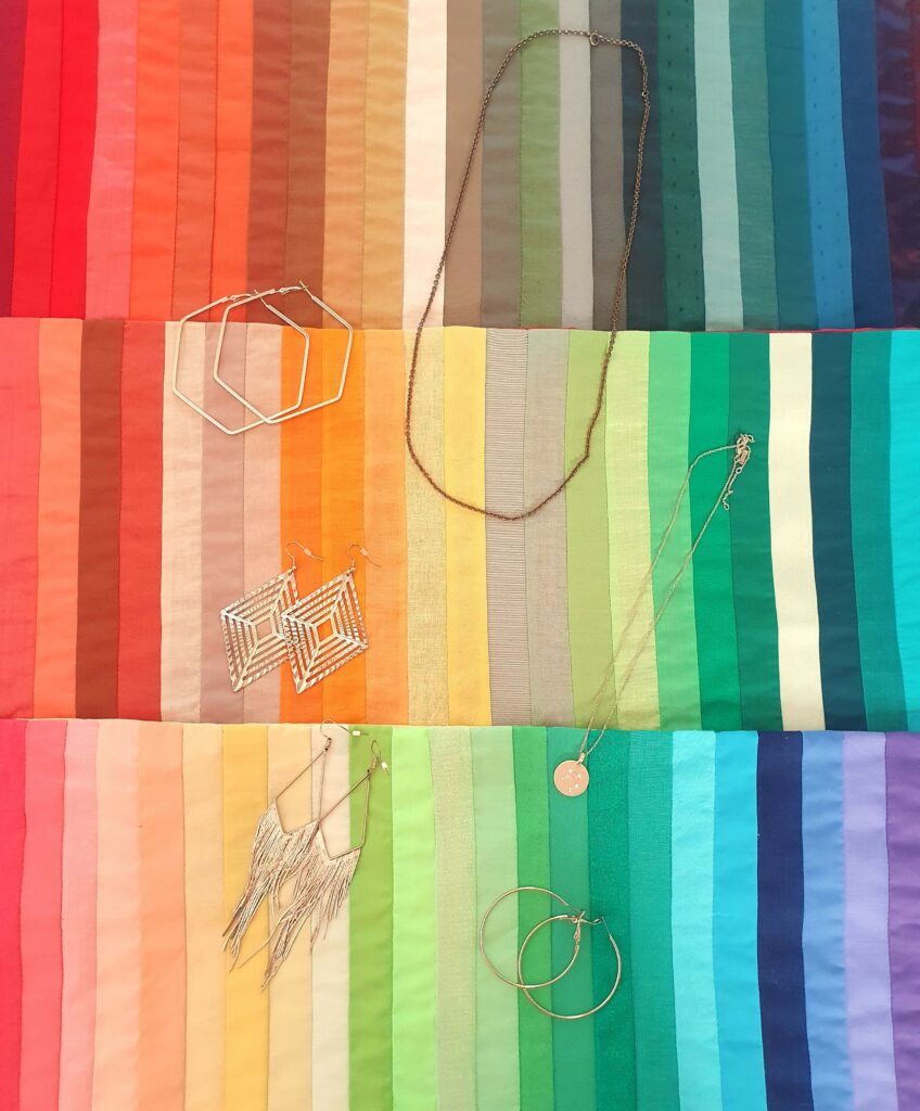
True autumn colours are also warm but muted and soft. Their value range is light to deep. Because true autumn, warm autumn and warm spring colours are more muted and soft compared to the true spring colours, great jewelry metal options for them are, for example, bronze and brass. The best jewelry metal for true springs is yellow gold. The picture below demonstrates the colour harmony between warm jewelry metals and other warm colours.
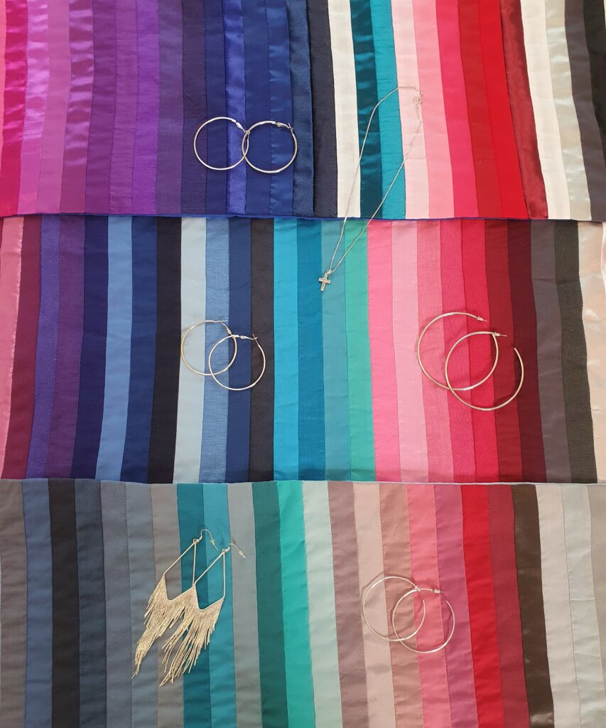
True summer colours are cool (blue-based), soft and muted, and relatively light. The most harmonious jewelry metals for true summers are silver, antique silver and pewter. True winter colours are cool, bright and icy, and their value range varies from light to deep. For true winters the best jewelry metals are silver, white gold and platinum. For cool summers and cool winters silver, white gold and pewter are great options. The picture below demonstrates the colour harmony between cool jewelry metals and other cool colours.
When colours are in harmony with a person, they don´t steal the attention from the person, or vice versa. Furthermore, if a person seems to drown in the colours or is overpowering the colours, the colours are not in harmony with them. When colours are in harmony with a person, we see the colours equally with the person. Colours that are in harmony with a person make their features pop, make them look fresh and their skin look smoother and reduce the appearance of fine lines, shadows and redness on the skin. The person shines with the colours.
Colour harmony can be perceived in person or by looking at pictures. If you would like to know what colours are in harmony with your features, you can learn more about my services here. You can also find more examples of colour harmony on Instagram @colourfulharmony.